Colors play a pivotal role in branding and business, as they significantly strengthen brand recognition and clearly differentiate companies from their competitors. Brands use color to create an emotional bond with consumers. Color is often the first thing people notice about a brand. Color psychology is essential because it directly influences how consumers perceive, trust, and engage with a business.
Approximately 60% to 90% of a consumer’s preliminary evaluation of a retailer is formed by color. Color strongly influences consumer decisions by creating emotions, establishing brand identity, and building trust. Color affects consumers’ choices by creating feelings, connection, and brand image. Different colors evoke different emotions and behavior. Warm colors like red and yellow produce energy and excitement, while cool colors like blue and white promote calmness and relaxation.
Color is one of the most essential components of visual identity. By choosing the right colors, you can create a strong visual identity. Colors directly influence specific emotions in consumers and their purchasing decisions. The purpose of helping businesses choose the right color is to build a strong, appealing, and effective brand presence.
What is Color Psychology?
Definition and basic concept
Color psychology is the study of colors and hues as different colors influence human mood, behavior, perception, and decision-making.
How colors evoke emotions and influence perception
Different colors trigger specific psychological emotions in people. Some colors, like blue evokes calmness, trust, and relaxation while red creates excitement, passion, or urgency.
Role in marketing and branding
Color plays a crucial role in marketing and branding. In marketing and branding, color psychology is emphasized on how colors impact a consumer’s decision to purchase a product.
Example: Fast-food brands use red & yellow to trigger appetite and urgency.
It’s all about color psychology. Red represents urgency. It triggers energy and excitement. On the other hand, yellow grabs attention instantly. It evokes feelings of happiness. These colors work together to stimulate your appetite and make you feel hungry. Fast food chains want you to associate their foods with positive emotions. That’s why fast food chains use red and yellow colors in their branding.
The Importance of Color in Business Branding

First impressions and brand identity
Colors are one of the first things we notice about a brand. We form the first impression of a brand within a second of seeing its color. By choosing a unique color palette, you can enhance your brand recognition and clearly differentiate your business from others.
Color consistency across platforms (logos, websites, packaging, etc.)
Color consistency in a business’s branding across all its platforms, such as logo, websites, social media, advertisement and even packaging, plays a crucial role and creates a strong visual brand identity. When we use the same colors consistently across all, it ensures brand recognition for customers and builds trust with your brand, even if customers forget the brand name.
Building recognition and emotional connection with the target audience
Color differentiates brands from others. It builds brand recognition by creating a visual identity and evokes an emotional connection with the target audience, which directly impacts purchasing decisions. Color affects our emotions and psychological responses. For example, red and orange are associated with urgency and enthusiasm, while blue and green create feelings of calm and peace.
Color Meanings and Associations :
Color Psychology explores how associations and meanings of colors influence emotions, perception, and decision-making. As a society, we learn how to associate certain things with certain colors. These associations directly impact a variety of things, like how we see a product or a brand.
Here is a breakdown of each color’s common associations and meanings —
Red :
Red is a bold, intense color associated with power and strength. It represents urgency, danger, and aggression. On the other hand, it is the color of love, passion, and desire. It is used to stimulate appetite, grab attention, and emphasize sales.
Yellow :
Yellow stands for optimism, happiness, creativity, and warmth. It promotes cheerfulness and draws attention. But in excess, it triggers caution and is linked with warning signs.
Blue :
Blue is a cool and calming color. It represents loyalty, strength, professionalism, and trust. It is a common choice for corporate branding because it builds trust and conveys stability and confidence. It symbolizes the sea and the sky.
Green :
Green is a color of nature and the environment. It symbolizes growth, freshness, health, finance, and balance. Green color is associated with nature and durability. It is the most restful color for our eyes.
Orange :
Orange is the combination of red and yellow. It stands for energy, happiness, and joy of life. It sparks enthusiasm, friendliness, passion, and strength. It is used ina call to action.
Purple :
Purple color is a blend of red and blue. Purple stands for royalty, wealth, power, and luxury. It suggests creativity, peace, sophistication, mystery, spirituality, and magic.
Black :
Black color means the absence of color. Black is a mysterious color that is associated with negative power. Black color symbolizes elegance, authority, stability, sophistication, seriousness, mystery, death, and evil. It is used in luxury fashion to give a modern and classy look. It is a very effective color to stand out from others. We use this color to add weight to a design.
White :
White stands for innocence and peace. It represents purity, simplicity, minimalism, perfection, and cleanliness. This color creates a sense of clarity and a fresh beginning. It is suitable for simple design and is also used in healthcare and modern technology. In most Western countries, white is the traditional color for brides.
Mixed/ Neutral Tones :
Mixed/neutral tones create balance, harmony, comfort, calmness, and a modern feel. They are colors without much intensity or saturation. We usually use these tones as a base to highlight other shades.
In branding and design, color is not just a visual element; it creates first impressions, carries emotions, and influences decisions. That’s why companies carefully choose their color palette to attract their audience.
How to Choose the Right Colors for Your Business :

Before choosing the right colors for your business, you need to understand what will influence your audience and strengthen your brand identity.
Before Selection Research:–
Knowing target audience – demographics & psychology
The audience’s demographic traits and psychological factors play a crucial role in choosing brand colors that connect with their emotions and influence their purchasing decisions. Color psychology helps you understand the meaning behind color choices.
Evaluate industry trends – common vs standout color choices
Industries mostly use common colors to build trust and feel familiar and reliable. Common colors help customers instantly recognize your brand, while standout colors differentiate your brand from competitors. These shades make your brand unique and memorable. Balancing both creates the perfect color strategy.
Consider cultural differences – global perception of colors
Colors have different meanings in different cultures. Cultural differences impact color perception. These variations in color perception influence language, art, fashion, and even social behavior. For example :
In Western countries, red often symbolizes danger, urgency, passion, and love, but in China, red signifies luck, prosperity, and happiness.
Selection Steps:
Step 1: Know your audience (who are you trying to attract?).
Before choosing colors, it is important to understand your target audience – who they are. You need to know some factors such as age, gender, culture, interests, education, occupation, location, and ethnicity.
For example, Children are attracted to bright, bold, and energetic colors, while mature adults prefer softer, muted, or harmonious tones. If you know your audience well, it helps you create the right design and product that emotionally connects with them and attracts the right customers.
Step 2: Define your brand personality (serious, playful, luxury, affordable?).
Every brand has a unique personality – it can be playful, serious, luxurious, affordable, and trustworthy. It reflects your brand’s value, tone of voice, and design style. The goal of brand personality is to build an identity that customers can interact with. Your brand personality helps customers understand and connect with your brand emotionally.
For example :
- A serious brand focuses on professionalism, trust ( e.g, bank and hospital )
- A playful brand feels fun, friendly, creative, and cheerful ( e.g- toy brand and an ice-cream brand )
- A luxury brand represents elegance and exclusivity ( e.g, jewelry and fashion brands)
If you define your brand personality clearly and maintain a consistent look and feel in everything such as logo, color palette, and customer engagement, your customers will recognize and trust your brand.
Step 3: Check industry trends (what colors competitors are using)
Checking industry trends and competitors’ color usage means you should analyze color choices used by other brands in your industry. Before choosing colors for your brand, first make a list of your main competitors. After that, you visit their website, social media platforms, and ads, and note down the colors that they use most often. This helps you understand which colors are common, popular, and easily recognizable. Finally, pick colors that are not commonly used in the industry, but are a good fit for your brand.
For example :
In the first food industry, red and yellow are common because they evoke appetite and excitement, but when a fast food brand chooses green, it symbolizes health and freshness.
In the tech industry, blue is commonly used; it represents trust and professionalism. When a tech brand uses purple, it shows modernity and innovation.
Using common colors helps you build a familiar and trustworthy image. But if you choose standout colors, they make your brand look unique and memorable.
Step 4: Build a palette (primary, secondary, accent colors).
A color palette is built with primary, secondary, and accent colors. This helps you create a balanced design that represents your brand’s visual identity. There are four main types of color palettes: monochromatic, triadic, analogous, and complementary.
Here is an explanation :
Primary colors: Primary colors are the main colors that are used for 60% of the design. A primary color is not made by mixing any other colors. The primary colors are red, yellow, and blue. They are commonly used for large areas such as backgrounds or main text. This helps other colors stand out.
Secondary colors: Secondary colors are used to support the primary colors. They add depth and visual interest. They are also used for subheadings. Secondary colors make up 30% of the design. A secondary color is created by combining two primary colors.
Accent colors: An accent color is used to grab quick attention and highlight the most crucial elements, making them stand out. It is used for about 10% of the design. Accent colors appear in icons, links, buttons, and calls to action. This color must create a strong contrast with the primary and secondary colors to enhance visibility.
As colors play a significant role in our brand, it’s important for us to use a well-chosen color palette. It helps you keep your brand consistent and easily recognizable across all platforms.
Step 5: Test across platforms (logo, website, packaging, social media).
Before finalizing your color palette, you should check every platform to ensure your elements are consistent. You must notice how your chosen colors look and perform in your brand.
Logo: You evaluate the logo on a small favicon, social media profile picture, and large billboard. You should notice your logo’s visibility on different backgrounds. You make sure the color appears properly in your logo and it should be readable and clear.
Website: You need to verify how the color looks on desktop computers, tablets, and mobiles. You maintain a consistent look on all browsers, like Chrome, Firefox, and Safari.
Packaging: As physical materials do not match digital screens, you should carefully test the samples and ensure the printed materials match the brand colors. The packaging must look consistent with the brand’s online presence.
Social media: You should maintain a consistent voice and visual identity across all platforms like Instagram, Facebook, X, LinkedIn, and TikTok. You should verify that your brand’s colors appear correctly in posts, banners, thumbnails, and ads.
You should check your brand on every platform to make sure it looks professional, consistent, and recognizable everywhere.
Practical Tips for Applying Colors

– Use case studies/examples (e.g., Coca-Cola = Red, Facebook = Blue)
You should verify real brand examples to understand how they use colors to influence customers’ perceptions, psychological emotions, and decisions.
Coca-Cola = Red: Red represents high energy, excitement, passion, urgency, and appetite. Coca-Cola uses a vibrant red to evoke a sense of excitement and energy, create strong brand recognition, and stimulate appetite. This color conveys a lively and joyful brand feeling.
Facebook = Blue: Blue represents trust, professionalism, calmness, and reliability. Facebook chose blue to convey reliability and security, which is why you feel safe while using the platform. It is a suitable color for social platforms.
By analyzing these examples, we can learn how real brands maintain a consistent color palette across all platforms. It helps us choose the right colors for our brand.
Balancing contrast, readability, and accessibility
“By choosing and applying colors, you make the design beautiful, but you must make sure it is readable and accessible to everyone. Color balancing in design for contrast, readability, and accessibility should follow WCAG contrast checker guidelines.”
Contrast: Color contrast is important for users to identify various text and non-text elements. A higher-contrast image is easy to see, while a low-contrast image is difficult to differentiate in high-bright or low-light conditions. Contrast means the difference between two colors. Color contrast is important because it makes sure that the text is readable against its background. If you have a darker color background, the text should be a light color.
Readability: Readability means the text or elements can be read and understood easily. You use a suitable font size. And always you use darker text on a light background or light text on a dark background, so you can read easily.
Accessibility: Color contrast is vital for accessibility because it ensures the content is readable and usable for everyone, including people with color blindness, low vision, and older users. You maintain high contrast between the text and the background. You add icons, labels, patterns, and underlines along with colors.
Tools to Help You Pick Colors
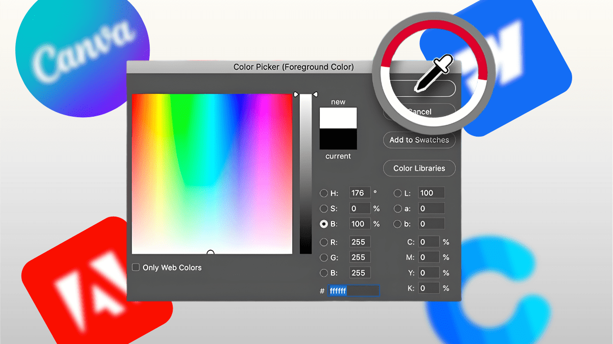
By choosing the right colors, you make your brand, logo, website, and social media posts look attractive and professional. There are a variety of free and paid tools available that help you easily find the best color combination for your design. These are Coolors, Adobe Color, Canva Color Palette Generator, Pantone Studio, and Color Muse. They also keep your brand colors consistent everywhere.
Free tools: Coolors, Adobe Color, Canva Color Palette Generator.
Free tools are usually web-based and are great for quick ideas to create palettes.
Coolors: Coolors is a very popular and fast color palette generator tool. You can generate random color palettes with one click. It helps you to lock desired colors, adjust shades, and explore palettes. It is an excellent tool for quickly checking different color combinations. It is great for beginners and designers.
Adobe Color: Adobe Color is a professional color creation tool. It is a very powerful tool for color schemes. You can create palettes using traditional color rules like analogous, monochromatic, triad, and complementary. You can extract color palettes from an image by using this. It is perfect for brand designers and UI/UX designers.
Canva Color Palette Generator : Canva is a simple tool that helps you generate a color palette quickly. It is also ideal for users who are looking to extract colors from an image. You can upload an image, and it will automatically create a palette from it. It is perfect for beginners.
Paid tools: Pantone Studio, Color Muse :
Paid tools generally provide powerful features, hardware support, and recognized color-matching systems that are crucial for keeping your brand colors consistent across different platforms.
Pantone Studio: Pantone Studio is a global standard color selection and color-matching tool. It is used to choose, create, and match accurate colors for design and branding. It helps you to ensure the same color consistently in both digital and physical materials. This is essential for those designers who need to use exact color accuracy. It is ideal for branding, printing, packaging, and product design.
Color Muse: Color Muse is a small color-matching physical device that can scan real-world objects and capture the exact matching colors. It helps you maintain accurate and consistent color in design. It shows digital color codes such as HEX, RGB, CMYK, LRV, etc. It is highly useful for professionals like painters, interior designers, and architects.
Quick tip: Use accessible palettes (contrast checkers)
Accessibility means everyone can read our content. We should use contrast checker tools such as WCAG Contrast Checker, Adobe Color Accessibility, and WebAIM. These ensure text is readable in the background and your colors work for everyone.
Common Mistakes to Avoid
Overloading with too many colors :
If you apply too many colors in a design that can make the design look messy, cluttered, and unprofessional. When too many shades appear together without proper balance, the brand identity becomes weaker, which makes the users confused, and they are not able to focus on the important message. Excessive colors can reduce readability and make the brand look inconsistent. But if you use a limited and well-defined color palette, it keeps the design clean, organized, and effective. And it helps your audience easily recognize your brand.
Ignoring accessibility (colorblind-friendly choices) :
Many people worldwide have some form of color blindness. If you don’t think about colorblind users while choosing colors for your design, some users may not be able to read or understand your content. They may find the overall design confusing. If you use red and green together for important messages, a colorblind person may see both as similar and receive an unclear message. That’s why you should choose accessible color combinations, maintain strong contrast between text and background, and follow WCAG contrast checker guidelines, which make your design usable for all users.
Inconsistency across platforms :
If you don’t use a consistent color code for your brand, your brand color appears differently across platforms such as websites, apps, prints, packaging, and social media posts. This may confuse users and decrease trust in your brand. Customers can’t be able to recognize your brand quickly because it looks unprofessional. Such inconsistency weakens your brand identity. Therefore, you should maintain a unified color system to make your brand strong and easily recognizable. Your brand should have a consistent look on every platform.
Choosing colors based only on personal preference, not audience psychology :
In design, colors carry emotional and psychological responses. So you should think about your target audience before choosing colors, not only based on your personal taste. Different colors create different meanings. For example, blue conveys trust and loyalty, red creates excitement and urgency, and green represents nature and calmness. Your design becomes more effective when you select colors that align with the target audience’s psychology.
Conclusion
Wrap-up importance of color in brand success :
Color plays a crucial role in brand success. Color is a psychological tool that influences consumers’ perception and decision-making. A well-chosen color palette evokes specific emotions, builds recognition, and creates a strong visual identity across all platforms — logo, website, ads, and products. This concept helps differentiate your brand from competitors. So you should choose the right colors wisely because they directly impact your brand’s success.
Encourage businesses to be intentional about color strategy
You should choose colors for your business very carefully, not by personal preference. Color is more than just decoration; it is a fundamental element that influences perception and evokes emotions. An intentional color strategy is a powerful asset for your business. This strategy helps your business stand out from others. Before choosing colors, you should think about the target audience, the psychology of colors, accessibility, consistency, and overall brand identity. So you need to choose the right colors to strengthen your brand in the industry and attract the target audience.
Final CTA: e.g., “Audit your current brand colors and see if they align with your vision”.
This means the CTA asks brands to check and update their visual look. This CTA gives a quick and impactful push that motivates users to think deeply about their brand’s visual identity. You look at your logo, website, social media, and products, and you check your brand colors carefully and analyze them. It ensures that your color palette is consistent across all platforms and materials because it helps build brand recognition and trust. If your audit reveals a mismatch, you need to update your color palette for a strong brand identity.
FAQs

1. What is color psychology in branding?
Color psychology in branding is the systematic use of colors to influence consumers’ emotions, perceptions, and decision-making. It creates emotional connections, builds brand identity, and triggers purchasing decisions. Therefore, it is important to choose the right colors for your brand by considering your audience’s psychological responses.
2. How do colors influence customer behavior?
Colors influence customer behavior by triggering emotions, guiding purchasing decisions, and grabbing attention. Specific colors help you build brand recognition, express personality, and create an immediate emotional connection that shapes how customers feel and act toward your products.
3. Which colors work best for small business branding?
The best colors for small business branding depend on your target audience, industry, and brand personality. Most successful brands use one or two colors for consistency. Different colors trigger different emotions — for example, blue is associated with trust and calmness, green relates to nature and growth, red represents energy and passion, and purple symbolizes luxury and spirituality. By choosing unique and consistent colors, you can build recognition and trust, make your small business branding more memorable, and stand out from competitors.
4. How many colors should a brand palette include?
A brand color palette typically includes three to five colors, but a simple palette uses two to three colors, such as one main color and one or two accent colors. These colors include one dominant color, secondary colors, and often one neutral color for text. Using two to three colors creates a highly recognizable and unified look, whereas using too many colors can create confusion and inconsistency.
5. Can I change my brand colors after launching my business?
Yes, you absolutely can change your brand colors after launching your business. Many successful brands do this to refine their identity. However, you need to make the change strategically. You should update all platforms—such as your logo, website, social media, and marketing materials—at once to maintain brand consistency. You should retain one familiar color to maintain brand recognition and avoid confusing customers.
6. Do cultural differences affect color meanings in branding?
Yes, cultural differences significantly affect color meanings in branding. Colors symbolize different emotions across cultures, so you must consider the target audience’s cultural context when choosing colors. For instance, in Western cultures, white represents innocence, but in many Asian cultures, it symbolizes death and mourning.
7. What are common mistakes businesses make when choosing colors?
Common mistakes businesses make when choosing brand colors based on personal preference instead of audience psychology, ignoring cultural differences, using too many colors, having low contrast between text and background, and using inconsistent colors across platforms.
8. How can I test if my brand colors are effective?
If you want to test the effectiveness of your brand colors, you focus on the target audience’s response, check color contrast, harmony, and accessibility, compare your industry and competitors, ensure color consistency on all platforms, and analyze color psychology for brand fit. Truly effective colors are memorable, readable, recognizable, emotionally engaging, and differentiate your brand.
9. Are there free tools to help choose the right brand colors?
Yes, there are several free tools like Coolors, Adobe Color, Canva Color Palette Generator, and Contrast Checker that help you choose the right brand colors. These tools generate color palettes from images and help you select color schemes based on color theory rules. Some tools also check contrast and accessibility to ensure your colors are readable for everyone.
10. Should I hire a designer to decide my brand colors, or can I do it myself?
You can decide your brand colors yourself if you have a good design sense, and this works well for personal brands and early-stage startups. However, if you want a strong, strategic, long-term brand, you should hire a professional designer. They understand color psychology and target audiences, ensure proper contrast, accessibility, and consistency across platforms, and make your brand more attractive and effective over time.
Add a Comment